Blue, Bluish and Blueness
The painter Eric Aho gave an interesting talk on his work this week at the Fleming Museum, and one of his observations was about the wide range of blues you sometimes see in the sky from horizon to apex. Painting outside, trying to keep up with changing clouds while I dip into each of the five blue pigments on my palette, I have often myself noticed--and been challenged--by the richness and variety of "sky blue".

Eric Aho, "Constable Squall" (detail)

Ultramarine, Cobalt, Cerulean, Cobalt Turquoise and Prussian blues
So, following up on last week's post on pigments, let's look more closely at the color blue. It's a hue with a long and complicated history that intersects with ancient philosophy, religion, psychology, economics, geography, chemistry--and with the full span of visual art, from Egyptian funerary sculpture up to contemporary conceptual installation.
Although Egyptians and Asians were skilled in the manufacture and use of indigo dyes and azure hues in a wide range of art, Greeks and Romans used blue sparingly, and actually had no general word to describe it. Some historians have questioned whether ancient Western societies even perceived what we now think of as "blue". Homer talked of "rosy-fingered dawn", but not the azure color of the Mediterranean. The Romans had little use for blue, associating it with barbarism, vulgarity, and Hades. Color perception, it seems, depends on culture as much as biology.

Greek vase painting

Egyptian papyrus painting
For the next 1,000 years, blue was a largely silent color in the western world. In the all-powerful Catholic Church, red, white and black dominated the color hierarchy in icons, vestments and religious symbols.
Then in 1100, in just a few decades, blue was "discovered" by Europe, and took a preeminent place in fashion, heraldry, religion, and painting--where it became the color associated with the newly-powerful Virgin Mary.

The Wilton Diptych (detail), 1395

Giotto, ceiling of the Arena chapel, 1300
The rarity of blue pigment, at this time made only from the semi-precious stone lapis lazuli, helped to create its new value in religious painting. The beautifully-named "Ultramarine" (brought "beyond the sea" from Afghanistan by Italian boats) was a brighter, more vivid hue when extracted in a complicated process from lapis lazuli. No wonder precise contracts between client and artist stipulated the exact quantity and quality of blue in the Virgin's celestial robes. Ultramarine pigment had become a status, as much as a spiritual, symbol.
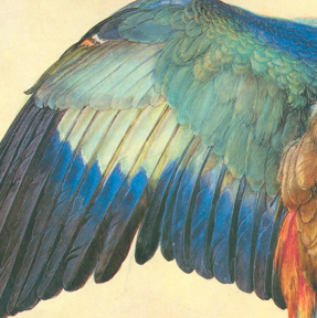
Durer, "Wing of a Blue roller" (detail), 1512

Titian, "Bacchus and Ariadne" (detail), 1523
By Titian's time, painters had transitioned from tempera to oils, and blue was now one color among many--still expensive, but no longer with the religious significance it held before the Renaissance. To model blue into a drape or render a sky in oils, white was a necessary addition, but white also diluted the prismatic power of Ultramarine.
Now a painter's skill in using light and dark to create an illusion of space and form came to the forefront. Ultramarine, still derived through a complex process from a semi-precious stone from the East, remained exorbitantly expensive for painters outside of Italy, who sometimes had to settle for adding white to charcoal for a pigment that was just "bluish" in cast.
Durer sometimes sprang for Ultramarine, but complained that it was 100 times more expensive than earth colors.
In the early 1700"s there occurred that kind of happy accident that seems so common in chemistry: a German color-maker, trying to salvage a batch of spoiled potash and turn it into a useable red, ended up astonished by the deep, intense Prussian Blue in his vat.
True to their national natures, the chauvinistic French called the new hue "Paris Blue" and no-nonsense Americans named it "Iron Blue". By 1750, this very affordable and permanent color was being used by artists across Europe.

John Constable, "Landscape with a Double Rainbow" (detail), 1812

Prussian's tinting strength was welcomed by landscape painters like Constable for the clean greens it provided, but treated with suspicion by many others because of its tendency to dominate all other colors in a painting if not used with a careful hand.
(This still holds true--see the comment section in the last "Painting Notes" post!) The art world was still waiting for a cheap primary blue.
The industrial revolution kicked into high gear In the 1800's, and it was time for an international competition to supply consumer demand. Voila! A French chemist won, and hence the term "French Ultramarine" for this new affordable, safe, and non-fading pigment.
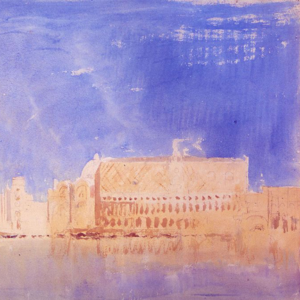
Turner, "Venice" (detail,) 1819
Richard Parkes Bonington, "Verona" (detail), 1827
I would argue that the introduction of inexpensive, portable, vivid blue pigments changed the way artists, and therefore society, saw the world. In ancient times, blue seems to have been nowhere--but now in the modern world, it was suddenly everywhere.
In light and shadow, trees and land, sea and sky, figures and interiors, blue was at home in a visual universe that had once been dominated by brown and grey. Finally blue had taken it's place on the color wheel, in nature, in daily life, in common consciousness.

Camille Pissarro, "Louveciennes" (detail), 1872
Felix Vallotton, "Interior" (detail), 1903
Some art historians see the history of painting as an inevitable march forward towards progress. I, like many other painters, find art cyclical and concurrent, a huge conversational circle that includes us, rather than a long line stretching behind us into the past.
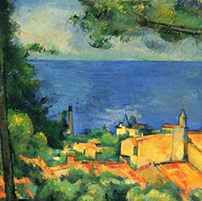
Cezanne, "The Gulf of Marseilles" (detail), 1885

Homer, "Natural Bridge, Bermuda" (detail), 1901
I think of that circle when looking at what happened to the color blue as the 19th century closed, and yet another new, yet old, way of seeing began.
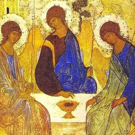
Eastern Orthodox icon, c. 1200

Matisse, "Zorah on the Terrace" (detail), 1912
As paintings moved away from deep illusion and back to the flatness of icons, blue led the way and became just blueness, the essence of sky and sea: pure, elemental pigment.

Joan Miro, "Bleu II" (detail) 1961

Yves Klein, "The Wave", c. 1960
When I paint, I take for granted the long and complicated history of blue (which, if I were to admit to such a childish thing, is my favorite color.) Whether I'm painting the manure-strewn barnyard across my road, or the dirty water of Portland's harbor, I am always moved by the true blue, blueness of blue.
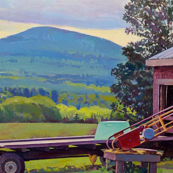
Susan Abbott, "Barn Yard, Cloudy Morning" (detail) 2011
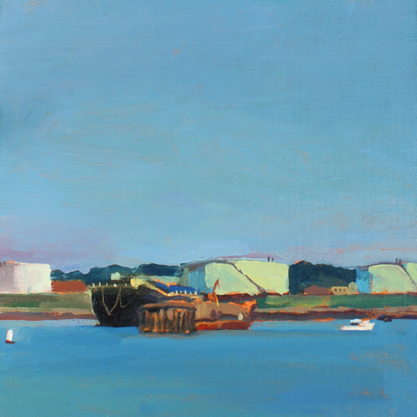
Susan Abbott, "From the Dock, Portland, Maine", 2012
For more reading on the history of blue and other pigments, I recommend "Bright Earth, The Invention of Colour" by Philip Ball.
Your comments are welcome below! Please feel free to leave your name and website.