Feeling Color
"A certain blue enters your soul. A certain red has an effect on your blood-pressure." Henri Matisse
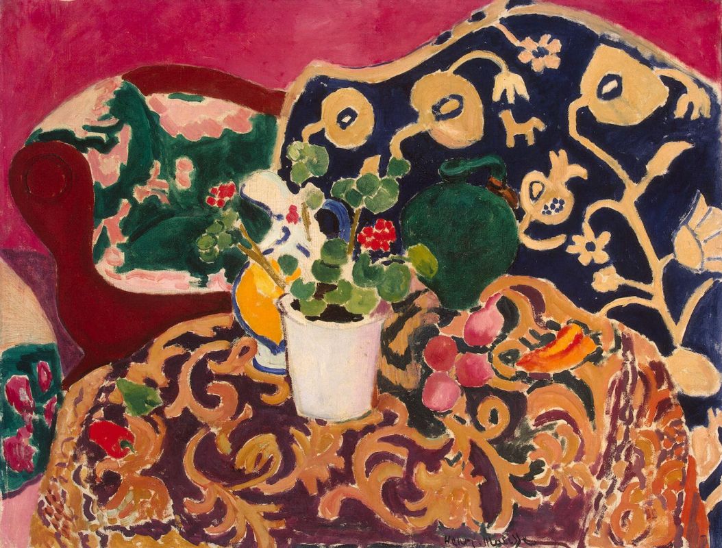
Henri Matisse, “Spanish Still Life”, oil
If the idea that we can "feel color" sounds like new age hokum to you, imagine this: You're in the hospital after surgery, and the nurse wheels you into a bright red recovery room. How does the color of those walls make you feel? Drowsy and ready to rest, or so agitated that you want to pull your tubes out, and run down the corridor?

Philip Guston, “Red Painting”, oil
Hospital rooms are painted pale green, and bordellos bright red, for a reason--to calm us down, or warm us up.

Cool Green vs. Warm Red
And there are ranges of emotion within those reds and blues. Imagine being in a room painted vibrant teal blue, then in one painted pale robin's egg blue. Which is more soothing? Color intensity triggers emotional intensity. I’d vote for the swatch on the right.

Teal Blue vs. Robin’s Egg Blue
Which of these rooms invites quiet contemplation, and which makes you twitch? It’s all about the color’s temperature and chroma.

It’s easy to see how color affects our mood in interior design, but the relationship between the two can be harder to understand with visual art.
We can use color many ways in painting: to turn a form, make a contrast, create a harmony. But the most powerful tool color offers is the ability to communicate a sensation of mood.
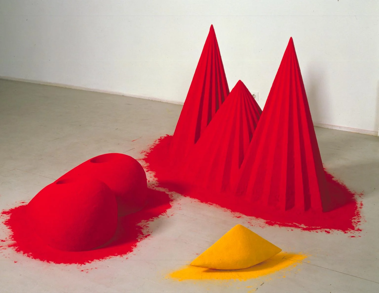
Anish Kapoor, “As if to Celebrate, I Discovered a Mountain Blooming with Red Flowers”, Pigment
Pure color, even when abstracted from form, can trigger our feelings as powerfully, and subtly, as sounds, tastes, smells and touch.
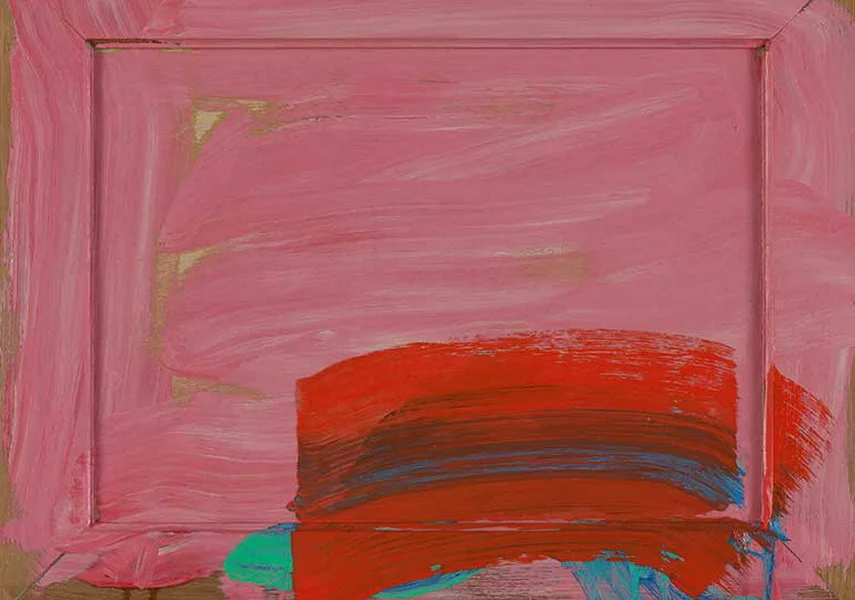
Howard Hodgkin, “In the Pink”, oil
Temperature is one of the prime emotional cues of color. The color wheel divides between warm and cool, with the boundary line running between red and green.
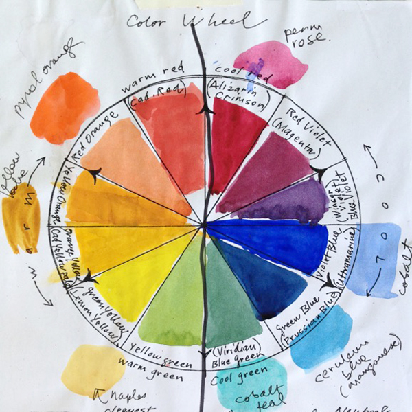
Susan Abbott, color wheel
This temperature difference in our palette colors is a powerful, but often overlooked, tool for painters. In it's simplest version, brown and blue can provide strong temperature contrast. (You can read more about the uses of those two colors in my blog post here.)

Susan Abbott, “Yard in Stowe”, watercolor
But painters have more than blue and brown in their temperature arsenal. They can also deploy a full range of hues on one side or the other of the color wheel to create a composition where warms like orange and chartreuse dominate.

Wolf Kahn, “Orange”, pastel
Or where cool hues like violet and blue-green take the lead.

Wolf Kahn, “near the Edge of the Woods”, pastel
And the mood of the painting will be different, depending on whether yellow or blue is the major key.

Susan Abbott, “Temperature Study”, watercolor
What a pale cool green, intense violet blue, clean bright yellow, or deep dark red says to me is difficult, if not impossible, to put into words--but no less real for that.
We don’t need to, and maybe we can’t, understand why, or how, a painting’s colors fill us with emotion. All we need to do is sit back, and enjoy the feeling.

Richard Diebenkorn, “Ocean Park, #105”, oil
Your comments are welcome below!